Adding interaction:
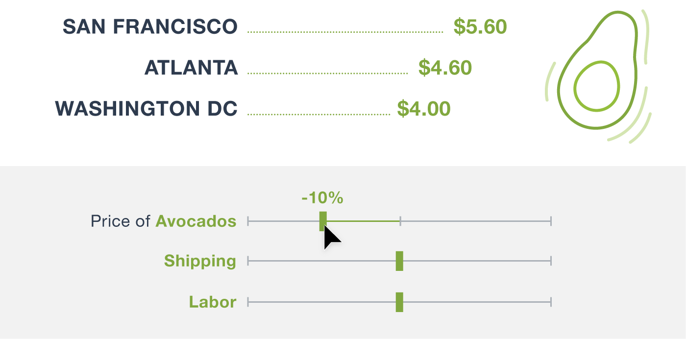
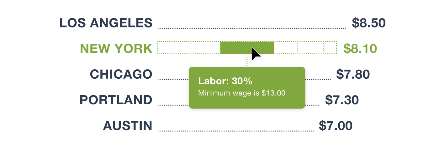
1. Show other data and tell a more comprehensive story of the restaurant industry. For instance, you could reveal a cost breakdown of the avocado toast price that includes less visible factors, such as labor and rent.
2. A toggle button switching between a list view and a heat map of the major cities and their toast prices. The map view may be enlightening if the price depends on proximity to major avocado sources, such as Mexico.
3. Sliders that illustrate how the cost of a specific variable affects the toast’s overall price. The city bars and prices would update as the user moves the slider above and below the normal cost of the variable.